Reflection at the end of Part Four

I have learned a terrific amount from studying Drawing1. Much of this learning has been about the use of media. I have experimented a great deal with mixed media and tried many new techniques, including monoprinting, phototransfer and etching. I have used chalk pastels, oil pastels, conte crayons, liquid graphite, powdered charcoal, gesso, a whole variety of water and shellac based inks – all these are new to me. I understand much better which media can be combined for different effects. I have also been introduced to, and discovered many new artists and feel much better educated about art generally.

Assignment Two confirmed for me how important it is to have a research topic and that when I have a research question in mind I push the boundaries and get excited in a way that I do not when I am  completing a set exercise. Assignment two also taught me to push through and keep going when things don’t work, and that often there is a way out the other side that would not have been achieved without things going wrong first.

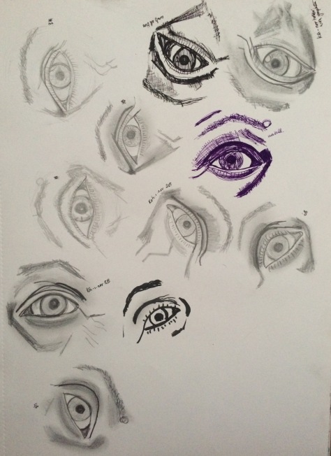
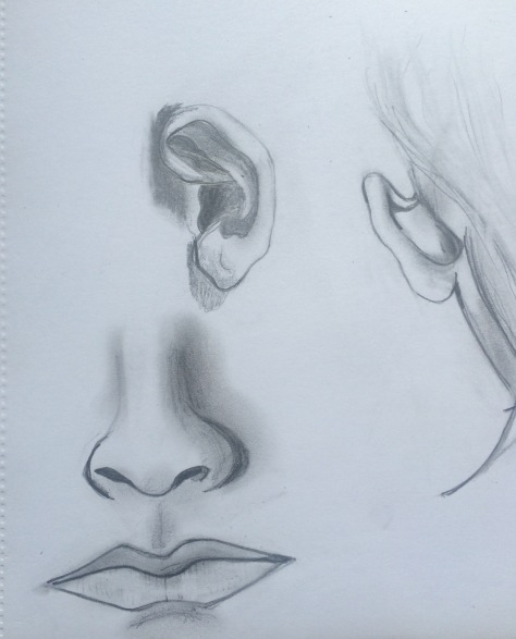
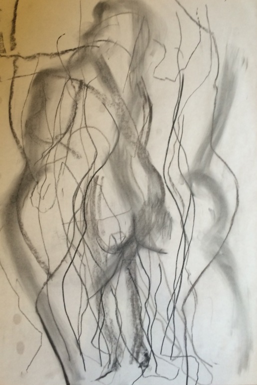
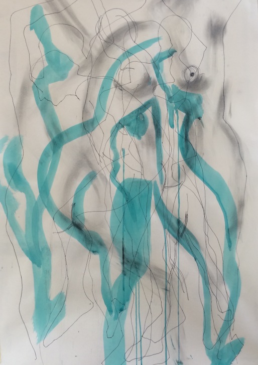
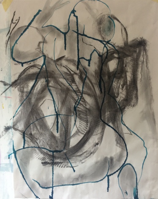
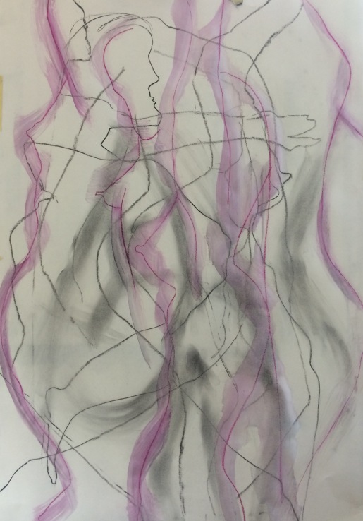
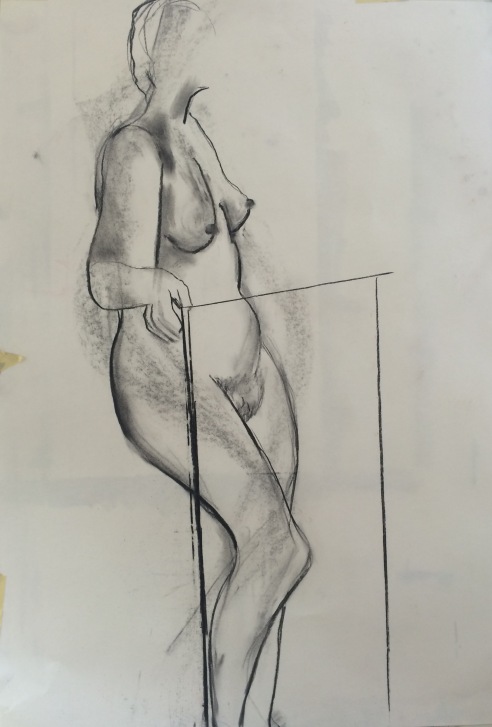
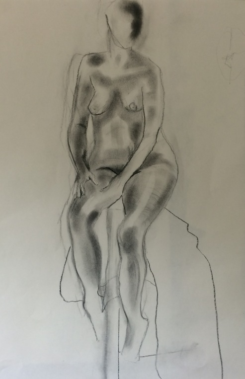
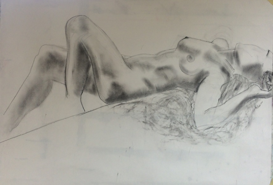
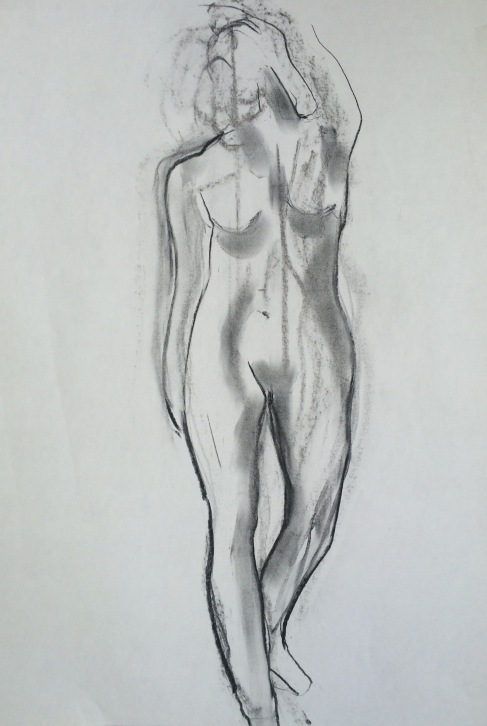
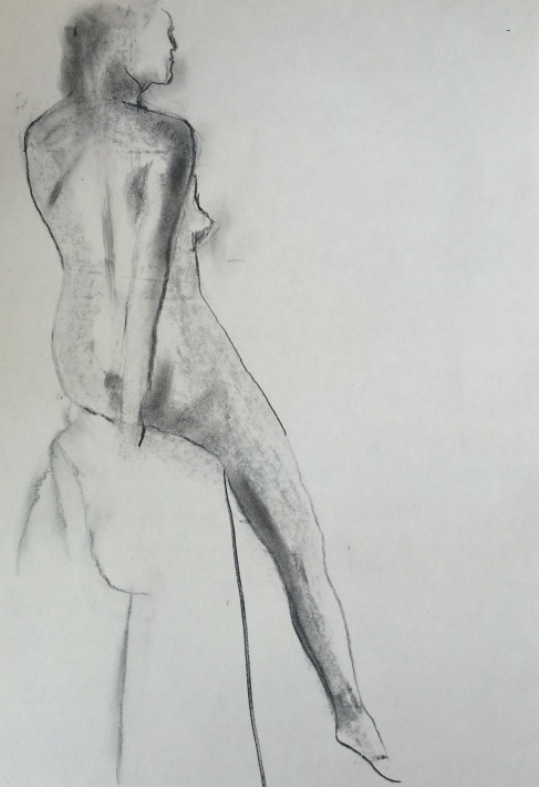
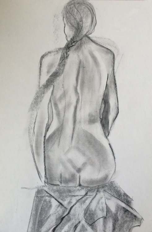
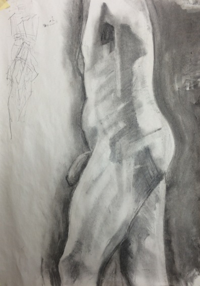
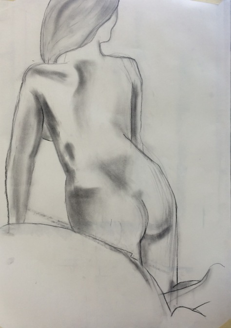
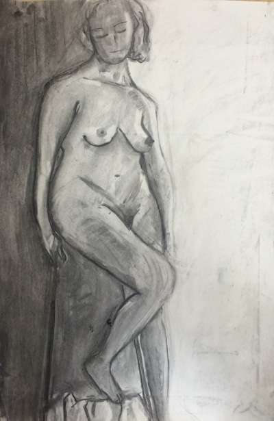
I understand that exercises are there to introduce techniques and that I need to learn technique, but I have often felt quite bored by them. I am not inspired, for example, by drawing doorways. Life drawing exercises have been the exception – I think I started to develop an approach to building form by looking at the angles and planes of the body using fine willow charcoal and powdered charcoal that I would like to develop.

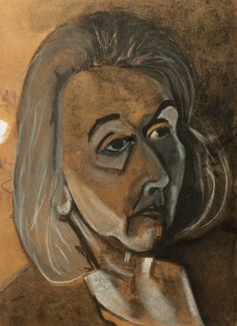
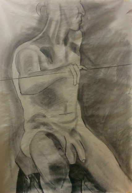
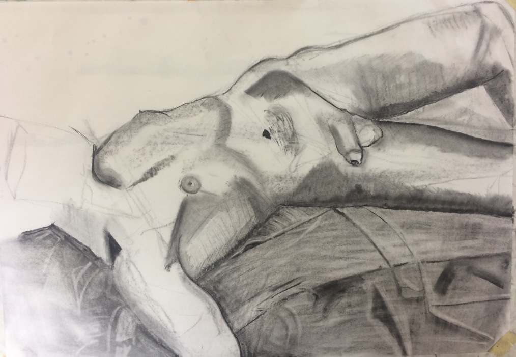
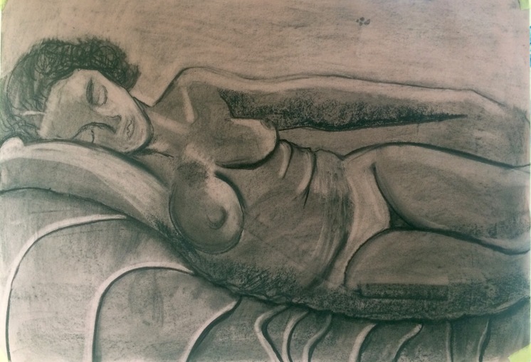
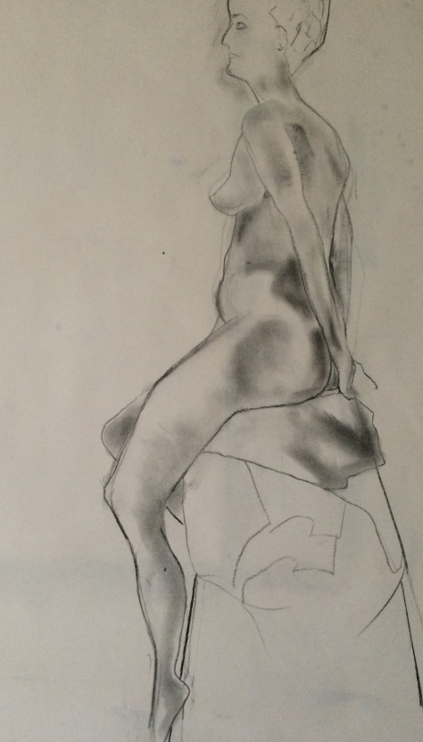
Assignment four was difficult for the same reason as the exercises. The ‘instructions’ were very specific – all three drawings on A1 and one figure must be in line and seated, the other in tone and reclining. However I did find both useful. First because I was forced to go big (this has been difficult for me on the course and each assignment has got slightly larger), and second because I  thought about line and mark making in a different way, and about the relationship between foreground and background. In the tonal work for both the portrait and the reclining figure I thought carefully about tonal contrast and light source. In each of the three drawings for assignment 4, I thought about composition and use of space.

I will try to bear all of these elements in mind in assignment 5. My research question for assignment 5 is: ‘How can the sense of  mysticism in the immutable Norber landscape be captured in drawings?’ I see this project as a development of assignments two and three, both of which were about ephemerality – this is about the opposite – endurance. To summarise, I will need to bear in mind:

  • line and mark making
  • tonal contrast
  • composition and best use of space
  • risk taking and experimentation
  • pattern (Herbert Reid – ‘Endurance is the repetition of pattern.’)
  • choice of support and drawing media to best explore the subject

I see my main weakness as procrastination and indecision before starting  – once I get stuck in I make rapid decisions. I need to trust my intuitive responses more and not overthink. Most of all I should not worry so much and should have fun (as I did with assignment 2). This is consistent with feedback from my tutor for assignment 3: “Try and work more intuitively and directly on a larger scale.”


PART 4.PROJECT 6: THE Face. EXERCISE 2- Your own face.

This drawing is in my A3 sketchbook with black,white and grey charcoal – I stuck a piece of brown wrapping paper in the sketchbook. nb the comments from peers below do not relate to this self portrait, but to another one that was here.  I have now moved this to final drawings in assignment 4.

IMG_4435

The main learning for me here is, don’t try and use charcoal on top of brown wrapping paper. It is very difficult to make it adhere and lots of it slid off. I kind of gave up in despair, and was just pleased to see the back of it. (the back of it looks better than the front). I guess, too, I start some exercises without enough enthusiasm and I’m tired and in a rush now to get this part of the course finished if I am going to finish the whole module in time – not a good context within which to try and draw.  I could keep working on it with charcoal. Or I could use it as an underdrawing and give it a coat of clear gesso then work on it with soft pastels. I like the colours. I might have a go tomorrow if I have time. The left eye needs moving further away from the nose and the angle is not quite right (the eyes are too close together).

PART 4. Project 6. Exercise 1. Individual facial features.

Each eye is drawn with a difference pencil (two with biro) ranging from 3H to 8B.The top right one is drawn with the koh-i-nor holder with graphite in it and I think this is great for shading. The koh-i-nor 8B graphite produces nice contrasts ranging from a light grey to black, and is therefore good for tonal work,  and the 4B and 6B pencils are both nice for getting sharp lines as well as shading.

img_4322

The sketches below are with a 4B pencil.

img_4337

PART 4: Reflection on drawing the figure

During January I have focused on figure drawing for part four of Drawing 1. I did some figure drawing one weekend about 3 years ago, and think in addition to this I have  spent about 5 days figure drawing over the last 20 years. So I am a beginner. My earliest attempts this months show my lack of understanding about how to go about drawing the figure ( the drawings on this blog are not necessarily presented in the order in which they were drawn – I have sorted them and posted them to fit with part 4 requirements – given that I had no control over the exercises set in the life drawing class!).

Although I am disappointed in aspects of each drawing, on the whole I think that during an intensive drawing course over four days this week, I have made terrific improvement. See for example the’pink’ drawing posted in a blog below under ‘longer studies’ on january 27th compared with the bottom drawing posted under ‘three figure drawings’ (blog date – 31st jan) which was actually drawn on the final day of the course on January 30th.

These two drawings are useful to compare because both are prone, on A1 and took one and a half hours ( they are different models).  I put them in again below for ease of comparison:

I think that the final drawing on the right, although missing a developed head, shows a  better understanding of proportion and tone.The left drawing basically has light and dark and nothing in-between. Perhaps in a photograph the drawing on the left is more eye catching because bigger,  she has a sweet face, and is rather more monumental, but the one on the right is more subtle and skilful.  I need to work toward combining this new understanding with the strengths that I think I see in the left drawing and have noticed in my better drawings before : a kind of monumentality and determination and solidity. I’m not one for fey. In terms of learning then:

  • go into the life drawing with confidence
  • work big
  • continue using charcoal (rather than pencil or pen) of different kinds (lumps, dust, sticks)
  • measure carefully and work out angles of the body before getting into any detail. mark these out with VERY fine charcoal lines.Keep measuring and checking as the drawing develops. Don’t use heavy lines at this point.
  • be prepared to move things around. don’t work in too much detail until proportions well established throughout the body
  • Use a putty rubber to get more tone
  • Avoid heavy black lines to delineate the outline of the body
  • Use charcoal dust to get silvery tones (creata colour sell it)
  • avoid coloured paper for now
  • Once an idea of the proportions is established start in the centre of the body and work out – looking for planes (rectangles, triangles and squares of dark and light)
  • use very fine charcoal sticks for fine detail and hatching and initial outline
  • don’t leave hands, feet and faces until the very end (and therefore avoid them)
  • make the background part of the drawing (the sofa works better on left drawing – I just didn’t leave time to add any marks to the support on the right – the marks showing are her hair, which actually reached the models ankles)
  • keep thinking about the relationship between drawing and painting in life drawing i.e. the way I have used charcoal in the right hand drawing could easily be adapted to paint medium.
  • Keep going to life drawing classes and seek a class where a longer pose is the norm to give time to fully develop a drawing (e.g. Heatherley art school in London  do a three day pose).


PART 4. project 4: exercise 2. Three figure drawings.

The brief here is to spend approximately one hour drawing a figure standing, seated and lounging, looking for tone and imagining skeleton and muscle as we draw. Each of the drawings below are on white cartridge A1. So the first drawing below is rather disconcerting because of the amount of pubic hair (I really dislike the modern attempts by women to make themselves look like pre-pubescent adolescents – I think it is feeding into a fantasy of the hairless women which is bordering on the paedophiliac. However, this drawing extends the pubic hairline to the extent that she looks as if she is wearing a pubic toupee). Apart from that the stance is reasonably accurate – she is actually leaning against a metal bar. I like the two drawings underneath. They both have good proportions, and the twist of the spine in the middle one is quite effective. I think that the bottom one has some good tonal work. I just wish I’d had time to work on her head – and her hair down to her ankles was really annoying.

img_4262

img_4276

img_4281

PART 4. Project 4: Exercise 1. Parts of the body

I started with the hands. Two of the drawings below are drawn with 4B pencil and the third with black uniball biro. I began with the sketch at the bottom and finished with the top one. I think my confidence grew with each sketch. They took about 15 minutes each.

img_4325

The feet below were drawn with 4B pencil. I hadn’t realised what a versatile pencil this is. You can draw black lines, quite light lines and smudge it for tonal work.

img_4333


PART 4. Project 3: Exercise 2: Essential elements.

The project here is to draw 6 ten minute studies and reflect on which is most successful. The brief is to look for areas of dark and light and not get bogged down in detail. Here are the three I have done so far – all on A2 and all in charcoal (charcoal dust and very fine charcoal stick):

img_4265

img_4264

img_4263

I find it difficult to say which is the most successful. I shifted the drawing immediately above to the right after I started, and therefore it has two spines and two bums and the back is too long. Nevertheless I still rather like it, particularly the head and plait. I think the middle drawing and the top drawing are pretty accurate and have a sense of weight. I particularly like the position of the arms on the top drawing. Perhaps I’d say the first two drawings are equally successful. I think the learning for me is to lay down my first lines very faintly indeed so they don’t show so strongly in the more developed drawing – charcoal doesn’t rub out as easily as I thought!

Part 4.Project 3: Form. Exercise 1- basic shapes

This exercise was about working on the planes of the body looking for shapes – triangles, rectangles. I tried to do this on A1 paper using charcoal. Quite a lot of it is drawn with very fine sticks of charcoal that I used to cross hatch – often swiping over with my finger. I have put them in here in the order in which they were drawn. I spent about one hour on the first one and probably two hours on drawing two and three and about an hour on the fourth drawing.

img_4259

img_4257

img_4256

img_4267

I have learned an awful lot from this exercise (much of my learning is  very useful for painting the figure too).I have struggled with tonal drawings before because I like to start with an outline. Here I have not been able to completely get away from this habit, but I have drawn the outline very faintly to begin with, and it has been very moveable. I  became much more interested in pattern and shape than with the actual figure, and I think this is a good thing in terms of creating form. Of the three drawings, the top one was the easiest to draw. I spent a long time on the waist down on the middle drawing and did the top half of the body much more quickly – thus running out of time. I would like to have worked on the hand, but the model took a break and the arm position was very  different afterwards – I decided I didn’t have time to work on it properly so left It. I think the right side should have been left white. The bottom drawing was a lot of fun. I enjoyed the cross hatching and working on the planes of the body and the fabric. I like the relationship between the body and the cloth. I wish I hadn’t drawn such a heavy black line on top of the nearside leg. Some of the blacks are too black. e.g. the belly button and hollow over the collar bone and the hip bone. On the whole I really like this drawing.  But I think the bottom drawing is the best one. Interestingly the first three drawings were all drawing on Monday 30th jan and the last drawing on wednesday 2nd – two days later after an intensive drawing course. I think there is clear improvement in terms of the the proportions and angles of the body. I wish I had more time to spend on this last drawing – I’d like to have worked on the settee to give some sense of form to that too.

Part 4.Project 2: exercise 2- A longer study

Today I worked on a couple of longer studies.The first is half an hour on A2 newsprint, the second, which was an hour and a half’s  pose,  on A1 pink sugar paper. I used the same approach in each – ‘washing ‘ the paper first in charcoal, doing some broad directional strokes with a lump of charcoal and then working on them with a putty rubber and thinner  charcoal.

img_4253

img_4255

The left shoulder on the top  drawing doesn’t  work – it should continue in a little before it joins the neck so the neck is less thick. This can easily be rectified. But also I think that the  head is a little big and this is more difficult to change at this point.  I think that the proportions of the one above are fairly accurate. On the whole I’m quite pleased with these, particularly with the proportions of the lower one – I’d have liked longer on each.

1st Feb.

Another  longer studies. It  took approximately one hour and is on A1.

img_4275

As with the structures of the body drawings, I think there is an improvement between the one hour poses on Monday, the third drawing done this morning, and the final drawing this afternoon (apart from her head which was too big so I guiloteened her).  I think that generally the proportions are pretty good (apart from the arm is a bit thin) and there is a better sense of three dimensionality. The shoulder blades work well above, and generally I think her whole torso has a sense of the twist to the right.  I do seem to work fairly slowly compared to others and I’d have liked another hour to work on the faces, hands and feet of both.The photo above has some strange yellow light on it, which is not on the actual drawing, and I will re-take the photo tomorrow.

NB. Watch the tendency to draw head too big.