July 2015
This week I went to the Tate modern to see the Sonia Delauny exhibition. I like her earlier work, for example , the Yellow Nude and Sleeping Girl. I think her use of colour is very evocative and her figures are strong and challenging. I also liked the long abstract panel in which the tango dancers were almost indistinguishable from the background, and her costumes for the ballet. However, although I love her use of colour, I was not taken with her later abstract works. They are pretty, bright, and cheerful, but they don’t say anything to me about the world and nor do they challenge me to think about colour differently – which I think might have been her aim, and which the two paintings here definitely do .

Tate Modern
FOR REVIEW ONLY

March 7th 2016. Tate Britain.
Any visit to the Tate Britain raises the question of what British art has been about for the last 5o years. I went to see the Frank Auerbach exhibition before it ends next week, but I also took ‘A walk around British Art’, and found it very depressing. I will come back to the question of what Art is all about later, and why i found tate britain depressing, but first: Frank Auerbach.
He still paints every day in his mid-80s, I believe. He has apparently painted the same models each day (i.e. one on monday, one on tuesday, etc) for over thirty years. His technique originally was to paint over the same canvas, with oil paint, thus his earlier portraits are about 2 in. thick in places. Since the 70s, though, I understand that he has scrapped off the paint and started over. The texture of the works is extraordinary. And so is his dedication and discipline.
However I start with two striking drawings below. In fact the self portrait on the right is one of my favourites of the exhibition. It is drawn with charcoal and chalk and in places the paper has been worn through with rubbing. There seems to be a patch over his forehead. I like the seemingly arbitrary nature of the lines of the portrait on the left. Without the head, interestingly I think that we would still recognise this as a body. Auerbach seems to start by scribbling over the paper in each drawing, which is rubbed out, so that both men emerge rather ghost-like, but still with character.


Next I chose two more recent paintings of the locality where Auerbach lives and works. The one on the right is Mornington Crescent, where I lived in the 1970s for six years when I first came to London.The second is Hampstead Road in High summer, 2010.Despite my comments about the general sense of depression and distress at the Tate Britain overall, these two paintings are vibrant, full of energy, texture and colour.His use of vertical lines and primary colours in each is striking. The figure in the left hand painting seems to skate through a towering urban landscape with ease and joy.


In contrast to the vibrancy of the two urbanscapes above, I was struck by these two portraits of EOW painted in 1961 (first, below) and 1955 (second, below). I have reproduced them as large images to show the texture of the paint more clearly – it seems to fold over on itself to form a three dimensional sculpture. The second painting could be of a woman burned to a cinder in a fire. Or she reminds me of the skulls found preserved in lime pits.


The oil below is one of my favourite paintings. this is a canvas measuring about 6′ x 4.5 ‘. This is EOW in the garden. I think that the colours are beautiful. The paint texture is like embroidery. The whole painting, to me, has a tactile softness – I want to touch it. It seems to me it would feel like velvet – in contrast to the head above which seems to me brittle and cold. An object of horror – I wonder how EOW felt about it.
Back to the ‘walk through British art’. To me, there was much to despair, some sleeze (I’m thinking Tracy Emin’s stained bed with its dirty sheets and piled ash tray – there’s nothing admirable about choosing to live in filth), and quite a bit of blank nothingness (I’m thinking the apricot nylon curtains hanging in the most contemporary section – I might be wrong – they might not be curtains and they might not be nylon. They might not even be apricot – I’d lost all interest by then). Are they a comment on the blank nothingness of much of contemporary culture? I guess apricot nylon curtains might be self-referential in terms of art being empty. But shouldn’t the artist do something about that rather than reproduce it? So, in terms of what is art – for me great art should ask me to reflect on the world and see it differently. Or see others experience of it differently. I’m not sure that Frank Auerbach’s work challenges me to see the world differently. It perhaps asks me to understand his experience of the world. There is not much in the walk through British art that is beautiful or uplifting. For me, the drawings of Henry Moore (a Yorkshire man!) are beautiful, as well as some of his sculptures are evocative of human strength and endurance. The drawing was completed in graphite, ink, watercolour and crayon.


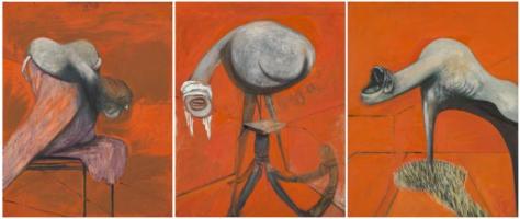
The work that touched me most profoundly was a surprise to me. I do not much like Frances Bacon’s paintings. However, his triptych, Studies for three figures at the base of the crucification is extraordinarily powerful. I thought, as I left, that perhaps Frances Bacon’s scream of pain has also left its mark on much of the work in the galleries – many of them express despair, distress, disillusion – but non of them in my view, to the extent that his work does. This earlier work from 1944 suggests that Bacon struggled with terror and pain before the suicides of his lovers: the focus for his 1972 triptych which this one seems to foreshadow. I have reproduced a moving statement by Bacon about this later tryptch below the paintings.

22nd March 2016. Jerwood Exhibition. Hastings. John Bratby and John Piper
This was a lucky break. I went down to Hastings to see the John Bratby exhibition, not knowing that there was also an exhibition of John Piper’s work on at the same time. Strangely only a couple of weeks ago I was thinking that I’d like to see some Piper work.
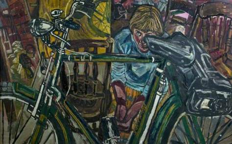
‘John Randall Bratby RA (19 July 1928 – 20 July 1992) was an English painter who founded the kitchen sink realism style of art that was influential in the late 1950s. He made portraits of his family and celebrities. His works were seen in television and film. Bratby was also a writer.’ (wikipedia). He also spent the last years of his life living in Hastings. The curators of the exhibition asked the people of Hastings to bring any work by Bratby along to put in the exhibition. This makes me feel particularly privileged to have seen the work since it is unlikely it will come together again. I loved this work! The reproductions here cannot begin to do it justice. For one thing many of the paintings are enormous – some must be 12 feet wide. For another they are very textured. Like Auberach’s paintings, the oil is layered thickly and in many cases applied directly by tube – this isn’t apparent from any photograph of his work. The manner of application often gives a ‘pointilist’ or mosaic appearance to the work, which together with the jewel-like colours, makes the paintings mostly joyous, and often amusing. One thing I liked about this work, which I think is lacking in much visual arts – is the sense of humour. I thought his depiction of women, particularly, often gives a humorous take on their long-suffering. Unusual contexts often reinforce this perception. Two women motorcycle mechanics is a good example as is JEAN WITH A BIKE. I went to this exhibition soon after visiting Auberach at the Tate. Both men are from the same period. Both are prolific painters – Auberach was dedicated to working over and over on the same subject – Bratby must have made hundreds of works of different subjects. Both paint their immediate locale. For me, Bratby was the more interesting of the two. I was so glad I went down from London to take a look. I hadn’t expected to enjoy it so much. Unfortunately Bratby seems out of fashion – reviews of the exhibition were not great. The Telegraph reviewer called him ‘second rate’. Whereas Auberach’s star is on the ascendent. I prefer Bratby’s work because the subjects are more interesting, the setting is often more central to the work, the colours and scale are powerful, and I think they have more to say about the political context and particularly about women.I also think that of the two Bratby has a better technical sense – the aforementioned motorcycle repair shop, for example, has a wonderfully interesting perspective of the shop. I’m now a huge fan.


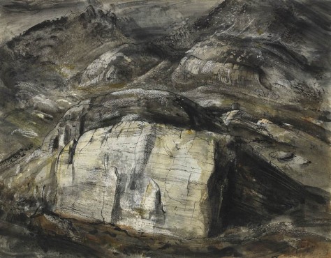
I mentioned above that I had wanted to see some John Piper work for a time and had resolved that, if I saw an exhibition, I would go along. so it was a tremendous surprise to find his work exhibited in the Jerwood. After Bratby I can only say I was disappointed. I was interested because of his mixed media work, buildings and ceramics (which I thought dreadful – I also make ceramics). Perhaps its his earlier work that I am not so keen on. I don’t remember the dates of most of the works on show, but they were more abstract. Here are a couple of examples:

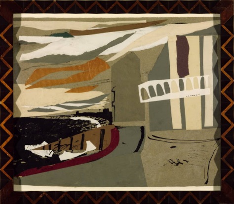
The above work is a collage with paper and ink, I believe. In contrast here is some later work:
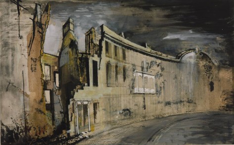

I think these later works are stunning. They are so atmospheric. The colours are beautiful. I read that he used oil paint with pastel on some works and this was already something I was thinking about. I also love his welsh stone works – another reason I was originally interested in him because of the work I plan on the rocks on Norber.
There is no doubt that he was an incredibly experimental and versatile artist. He is also well known for his stained glass windows. When I do my churchyard project for assignment two I will study him in detail and make an effort to go and see more of his work.
2 April. 2016. Nikolai Astrup. Dulwich picture gallery.
The gallery describe Astrup as seeking: ‘a national “visual language” that evoked the traditions and folklore of his homeland. Best known for his luminous paintings of Midsummer Eve bonfires, Astrup’s landscapes evoke the atmosphere and changing seasons of his home district of Jølster. Places important to Astrup – the old parsonage where he grew up, his beautiful farmstead at Sandalstrand (named “Astruptunet” after him), and the lake Jølstravatnet were to become the focus and inspiration of a unique and extraordinary body of work.’


These are large paintings. My feeling is that whereas the photographs of Bratby’s work do him no justice at all, the photographs of Astrup’s work do him more justice than the works themselves. This is harsh, and the reviews in the newspapers for these works were full of praise – he is described as the ‘lost’ Norwegian artist on a par with Munch. All I can say is that I was not moved by the work, except to a feeling of antagonism. While they are very colourful, I found them dark and a little menacing. There seemed to me some brooding menace in the merry bonfire midsummer celebrations, and even in the pulling of the rhubarb above. Perhaps its the mountains that tower over almost every scene. Perhaps the tree in the first picture above – reaching up like a Norwegian troll – captures the essence of the work? Possibly the artist himself? Perhaps its the skies that I’m responding to here. Or the use of colour? Certainly I think that the greens and purples used so much in the rhubarb picture are a fairly dismal combination. In fact he uses green and purple quite a bit in all three painting here. Hmmm. I will look at other works again.
25th April. Esotrick Gallery.
I went to the Estorick Gallery in Islington because I wanted to investigate the Futurists and find out more about their interest in change/time because of my work for assignment two. This is a tiny gallery in Canonbury, Islington that I used to pass on my way home for years, and meant to visit. Its a little known gallery, I believe, and although small, a nice visit. It focuses on the collection of Estorick who was specifically interested in contemporary Italian works. There are a couple of Modilgliani sketches, for example. The gallery houses a small group of paintings by futurists, including Severini, Conti and Balla.Below is Severini’s painting, ‘The Boulevard’ and below that Ball,’The hand of the violinist.’ As I understand it they were reacting against the way in which they felt Italian art had been stifled by the ‘Masters’ and tradition and were interested in dynamism and movement. As such I find their ideas very interesting, although I don’t respond emotionally to them in the way I responded, say, to Bratby’s interiors or Piper’s buildings.


August 15th 2016 .Courtauld gallery.Georgina Houghton:spirit drawings.
‘Georgiana Houghton (1814-1884) was a Spiritualist medium who, in the 1860s and 70s, produced an astonishing series of abstract watercolours. Detailed explanations on the back of the works declare that her hand was guided by various spirits, including several Renaissance artists, as well as higher angelic beings. In this exhibition The Courtauld Galley explores this astounding series of largely abstract Victorian watercolours and offers visitors a unique opportunity to view remarkable works which have not been shown in the UK for nearly 150 years.’ (exhibition blurb).

The above watercolour which I guess is about 18inx 24 in is purportedly a portrait of Jesus.The drawings each represent the ‘soul flower’ of an individual. They are many layered,and I think, extraordinary detailed, powerfully emotive and unexpectedly beautiful.
Regarding Trees at the Courtauld.
On the same visit I also viewed this exhibition of trees -20 drawings in all out of a collection of over 500, ranging from an individual tree to a group of trees. I was particularly interested because of the tree exercises on part two,and also because I intend drawing trees on Norber -see assignment 5. I love trees, and as the curator of this exhibition writes, they are the largest and most enduring of all natural things. The drawings range from the early sixteenth to the mid nineteenth centuries and including works by Fra Bartolommeo, Jan van Goyen, Claude Lorrain and John Constable, among others.

Thomas Hearne (1744-1817), The Chestnut Tree at Little Wymondley, Hertfordshire, 1789
Most of the drawings are quite small. I noted that pencil and ink are used together with grey,brown and blue washes quite a lot. I must learn from this.
17th August 2016. Royal Academy. David Hockney.82 portraits and a still life.

As with the spring awakening exhibition, below, Hockney has painted fast and furiously to complete 90 portraits in two years – that’s nearly one a week. They are the all the same size – about 4′ x 5′. As a group they are amazing. The background of each is blue and turquoise. The chair is always yellow. The sitters have character. Celia Birtwhistle above looks rather careful and neat with her hands and feet carefully placed. George looks a bit cynical, but more engaged with the world – he’s looking more directly at us. His hands are more expressive-he’s pointing at himself. He looks like he’d be the centre of a party. So they are interesting portraits, but like the landscapes below, as you get closer to study an individual portrait, they become less interesting, and more crude. I think that David Hockney himself said that these paintings should be viewed as a collection. They belong together: let’s hope they find a permanent home – like spring awakening below, which I believe has a permanent home in the salt gallery.
August 18th 2016.National Portrait Gallery. BP awards
I usually find something to admire at the BP awards, and I go every year. This year I didn’t find anything. Of all on display I picked the one below because she reminds me of the Mona Lisa. I imagine deliberately so. She is a little ambiguous.She is obviously painted with technical skill and I like the use of paint and colours. I am not sure what I think of her expression and hand. There’s something bit off about the angle of the hand. It seems a little self-conscious to me – perhaps as much on the part of the painter as the sitter. She has beautiful eyes.

I didn’t particularly enjoy the exhibition. I didn’t feel moved by any of the portraits and thought that on the whole there was a lack of originality and that the curators had gone for safety. I felt that particularly about the first prize winner below. This painting by Clare Drummond seems particularly insipid to me. Apart from pretty colours I cannot understand why it was chosen.

At least the second prize winner’s technical ability is pretty awesome. He has chosen to paint his dying grandmother. Apparently she cannot speak – no wonder she is furious. One of the reasons this is an interesting painting is that like photography, it is voyeuristic and ethically, questionable because it intrudes on the last moments of this women’s life.

I feel sure that a young Bacon or Auerback or Dumas would not have got into this exhibition. This is not to say I don’t like realist portraits – I like them a lot,but I like them to say something meaningful about the sitter or society or probably both.
September 15th 2016.David Hockney. Saltaire.Salt Mills. David Hockney. Spring Awakening.
I think there are 80 drawings,done on an iPad,and printed on an inkjet printer about 3’6″ x 4’6″. Like the portraits, one must admire the output and energy -completed between 1st jan. 2011 and the end of May 2011. As a group,the work is admirable,colourful and from a distance the work is striking.In my view the sense of joy and awe is lost the closer one gets to an individual work. Still I like the focus on this one road over a five month period, as the season and weather changes. It’s the kind of study I would enjoy myself.I particularly like Hockney’s use of colour, composition and shadows in the foreground. I like the trees’ wild ownership of the canvas. This is Yorkshire. Hockney is a Yorkshireman. I am a Yorkshire woman – of course the Yorkshire landscape is the most evocative in the world!
September 17th 2016.Liverpool Tate.Frances Bacon.
I am so glad I went to see the Bacon exhibition the day before it closed in Liverpool. So,now I am a Bacon groupie. I think his work is extraordinary, amazing and I can understand why he is so followed and admired. Going into the gallery in which his work was hung was like going into a Church.The atmosphere was heavy and reverential. I don’t think this was emanating from the viewers – it was emanating from the paintings. Of all the exhibitions I have seen in the last two years this is to me the most important (followed by Egon Schiele and Marlene Dumas in that order).Bacon tells us about the human condition like no other. His figures shriek and howl in pain. Their pain distorts and knots them into unrecognisable, grotesque shapes . They are often caged and trapped like other animals in a zoo. He uses repeated motifs, like the umbrella below, and the body as a lump of meat. Beyond the horror,he uses colour and mark and texture to make the suffering almost beautiful. I have added below three of his earlier works (1945-46). These studies of the human figure seem to me to teeter on the line between supreme despair and ecstasy – like no other. I just realised that all three artists mentioned in this post have much in common. They all paint portraits/the figure, they are all concerned with despair and cruelty, they are all concerned with sexuality, and they all wonderful colourists.


Tate Gallery. 8th October. 2016
I went to see three exhibitions at the Tate today : Georgia O’Keefe, Wilfredo Lam and Bhupen Khakhar (these are all separate and large exhibitions). I thought it would be interesting to compare and contrast them.Georgia O’Keefe and Wilfredo Lam were contemporaries. Khakhar was burn in 1934 in India. All three were painting outside the mainstream middle class, male art world.Georgia because she was female, Lam was Cuban/Chinese and Khakhar was Indian. However while Lam’s art explores culture and ‘examined the place of the individual within twentieth-century society, marked by political conflict and the legacy of colonialism’, Khakhar professes to present the world as he experiences it, and presumably the same can be said for O’keefe. But in fact Khakhar’s themes are troubling (if often humorous), and often are about alienation and looking in on the lives of others.
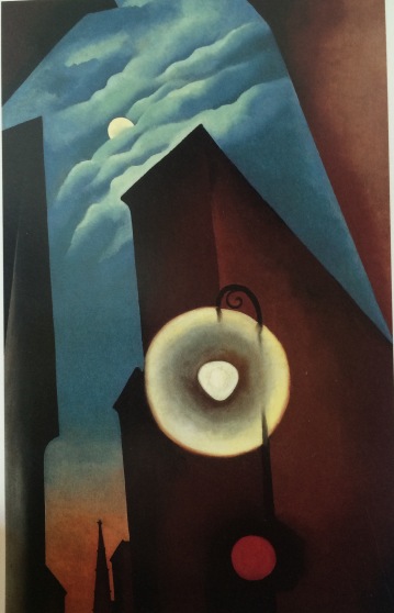
I will start with O’Keefe. The three paintings below are from 1925, 1928 and 1930 respectively. I picked these because I like them better than others in the show. The paintings of the metropolis also show her fine sense of colour and shape. The street light, the moon and the red sphere are like echoes of one another. The clouds already show her interest in folds, depth and fine tonal quality. The abstracted shapes are beautiful. In my view this is the strongest piece of work.
.
The city below stretches infinitely. As in the painting above, O’Keefe achieves a sense of alienation, industry and destruction of nature. I find it interesting that pretty much after these works she seems to have concentrated almost exclusively on nature. And yet to me the lack of any natural detail in these works makes them all the stronger. I find it interesting to that this is a ‘man made world’ – almost literally, and her works here lack all reference to femininity or female concerns.How disappointing then, that she turned to flowers!
I have not included a flower or a bone here, because I hate them. What a pity that O’Keefe, with her wonderful use of colour, detail and line became a flower and bone painter instead of, like Lam, using her skill to explore her place as a female in 20th century society. Of course, feminists (I am a feminist) will no doubt disagree and say that her paintings are all about female sexuality. I believe she refuted this. It seems to be condescending to say an artists paintings are about one thing when she herself says not.But suppose they are, unconsciously, about female sexuality, suppose they are about the connection between the feminine and nature – then I would argue that this doesn’t seem to quite work as a comment on the experience of individual in society. Having said that, I think that the contrast between the painting above and the painting below is tremendous – what a pity there wasn’t more of this (these paintings were not contrasted or hung side by side in the gallery). Also I do admire again the total work in the landscape below and her bold use of colour.

What an interesting man Lam was. He studied in Cuba and Madrid, and fought in the Spanish civil war. He knew Picasso. He was clearly influenced by spanish painters in his earlier work. However these works below (both enormous) show his developing interest when he returned to cuba with the Santeria religion and with finding a bridge between modernist art and African art. There is, I think, a lot of symbolism that was lost on me, but nevertheless I found the works powerful as well as beautiful. He also became very involved in printing when he lived in Italia and with narrative forms of illustration and painting. For me, these works, and those of Khakhar below, repay detailed examination – there is a lot of interesting stuff going on – I’m not sure I would say the same about O’Keefe – I guess she wasn’t setting out to narrate a story but to convey an impression. I like story in art.Of course I also like people in art – and O’Keefe doesn’t have any truck with people (although I did see a self portrait online which was brilliant).


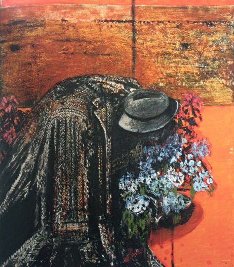
Khakhar’s work is brimming with people.It may be about presenting the world as he experienced it – but it is the world of people as he experiences them. And it is all about narrative. I read an incredibly damning review of this exhibition by Jonathan Jones in the Guardian. Jones compared Khakhar with Beryl Cook and wrote that he thought there was some kind of inverse racism going on that got Khakhar’s work into the Tate – in his view he is talentless. I guess there is some similarity with Beryl Cook – the obvious being strong colour and the use of humour and naively drawn figures.But I liked this exhibition. I liked his bravery in painting scenes of homosexuality – Jones thought this was crude and run of the mill – but I haven’t seen art in the Tate before that explores homosexuality. I was shocked mostly by the Tate itself – the explicitly sexual paintings are in a little room at the end with a WARNING sign! I thought this was typically prudish of the Tate and particularly ironic since two things I noted that Khakhar said were that the colonists had made Indian people ashamed of their sexuality (first) and separately, that the word he hated was ‘safety’!

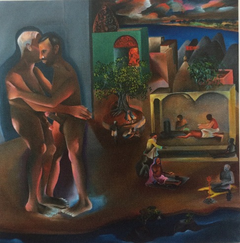
I also like that Khakhar explores the everyday, for example, the man sitting in the pub, or the workers on strike,or the man at the barbers, or himself having an enema after he was diagnosed with prostate cancer.I responded to his gentle humour and his humanity.This is a man,one feels, who looks at the world a little wistfully and sadly, but with love. Jonathan Jones of the Guardian could do with a bit more humanity and love.

January 2017
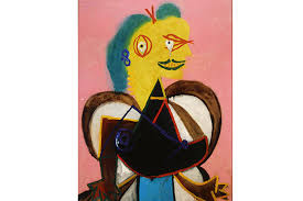
Picasso Portraits at The National Portrait Gallery
So I finally get Picasso. He is a joker – a comedian with a good sense of humour. He is having a laugh and his drawings are funny. Why didn’t someone tell me! The curator of this exhibition has thought fit to include Picasso’s doodle’s, and these prove it. (I am sure he did not think in his wildest dreams that crude, but funny sketches on napkins or magazines would be seen by thousands of people from around the world in one of the most prestigious London galleries; a lesson for all of us when we are famous – burn all those mistakes).I don’t mind a comic artist who is a good cartoonist – I just don’t want him held up to me as an artist I should stand and worship.More importantly, I have been to some exhibitions in the last year that left me thinking the artist had communicated something vitally important, and feeling incredibly moved (Francis Bacon above all, but also Egon Schiele and Marlene Dumas). Picasso’s portraits in my view, lack a sense of empathy at the tragedy underlying the human condition: something these other three artists understand. Glimmers of it come through in the works he produced during the occupation of Paris, and in the tiny sketch of his lover at this time. I think we see it in Gurnica (which is not in this exhibition). The only portrait I thought good was the cubist portrait of Kahnweiler – and I thought it technically interesting but didn’t feel any emotional connection to it (it’s not amongst the image below).
Having done more research on Picasso after the exhibition I now have more insight into why I disliked so much of his work. Picasso was not a nice man. Two of his lovers committed suicide, one became a recluse, several suffered from severe depression. He had dozens of lovers and was unfaithful to them all. This man was a woman hater (it is not true that men who sleep around do it because they like women) – and I think this is clear in his work. Many of Picasso’s portraits of women (and most of them are) slice them up and dismember them – they are shown as pathetic, tearful, out of joint.(The big fat angelic madonna is an exception, but this is just another stereotype). We wouldn’t idolise a racist who painted demeaning portraits of people from ethnic minorities, so why do we idolise a sexist monster?
I understand that Picasso changed the art world and influenced other artists who followed. I guess for this reason he is important. But, again in my view, influencing other artists is not in itself a sufficient reason for an artist being remembered as great. Influence can be for the good or the bad.


Jan 27th 2017
The Australian impressionists’ exhibition is at The National Gallery. How interesting to learn that impressionism seems to have something to do with painting outdoors! And the need to catch a fleeting impression of the scene before the weather changes! But this doesn’t quite make sense to me – surely many artists painted outdoors before the impressionists came along? Turner? Constable? Anyway the Australian Impressionists represented here are Tom Roberts, Arthur Streeton, John Russell and Charles Conder who painted in Melbourne in the 1880s. They apparently aimed for ‘truth to nature’ and worked in the open air, sketching quickly, applying their paint rapidly and capturing instantaneous impressions. The resulting oil sketches, which they considered to be finished works of art, were exhibited in a ‘9 by 5’ Impression Exhibition, held in Melbourne in August 1889. This group of Australian artists has been referred to as the Heidelberg School, after the site of one of their painting camps at Eaglemont, near Heidelberg. I particularly like the work of Charles Conder who captures what I imagine is the brighness of the Australian light (I have never been to the southern hemisphere).

It makes me feel tired just looking at it! How interesting that the parasol seems to have been abandoned – I imagine the woman carrying it was just too hot and exhausted to carry it one step further. The painting is full of intrigue and set up for narrative interpretation. Is the man with the black hat with the woman in a red one – have they just quarrelled? what is he looking at? The separation between all the figures seems to reflect the vastness of the space around and the washed out colours embassies this slightly hazy suspension of reality. Despite never having been to Australia my feeling is that this painting could not be anywhere else – it has a great sense of place.
Below is another painting by Conder – not actually in the exhibition which remained true to its emphasis on impressionism as an outdoor movement – but I’m intrigued by the idea that the woman on the beach above has now moved indoors and she and the room still give the impression of heat, and space. What a beautiful and I think unusual palette? And again the colour is strong yet slightly washed out by a wash of paler, slightly muddier? hues . There’s almost nothing happening in half the painting and yet I think the composition is strong – my eye searches round the image to find some clue to the woman and her gaze, and finds nothing. I think she’s still undecided about the actions of the man on the beach! She might jump off that chair arm any second and march off in a high dungeon.

The painting below by Arthur Streeton, ‘Ariadne’ uses a stronger palette of pinks and blues. I think it has the same wistful quality as the beach painting above. People feel abandoned on these white beaches like flotsum and jetsam. I notice the date of the painting below is 1895 but it seems to have a peculiarly contemporary feel
I have to add, only a week after seeing this exhibition, I struggle to remember anything I saw. I think the visual images that easily come to mind must say something about their impact – for example it is over two years now since I saw the Schiele exhibition at the Cortauld and yet I can see some of them as clear as day. I could also recognise a Schiele that I hadn’t seen before because his style is so distinctive. The same is true of Bacon, probably Dumas, Hockney and Picasso (even if, in the case of the latter two, I don’t particularly like the images that swim before my eyes).
24th February 2017
I am not a huge fan of Merce Cunningham or John Cage. Apart from Rambert or Wayne McGregor, I have not enjoyed very much contemporary dance that I have seen (and I went to see quite a lot when my daughter was training at the Northern School of Contemporary Dance) and I can see how Rauschenberg fits into this world of chance. experimentation and challenge to the traditional art forms of dance, music and art . Apparently Rauschenberg worked with Cunningham first as a set designer and later choreographed some performances himself. The exhibition at the Tate is huge – he was certainly prolific, and to me it seems he had a lot of fun. Still, I am now not a huge fan of Rauschenberg either. The works I liked best were amongst the smallest in size – about 14 in x 18″ and there were 34 of them – each representing Dante’s inferno. Together they are quite impressive. They are drawn in gouache and mixed media, and include image transfers. Here are two. The one on the left represents Hell and is Canto XX. I think the one on the right was Canto XXXII:


It seems fair to say that Rauschenberg was very creative and continued throughout his life to experiment: apart from painting (or perhaps I should call them mixed media works), screen printing, photo transfer, live performance, he also made many sculptures using found materials, for example car doors or cardboard boxes, which I couldn’t find anything of merit in. The Tate modern exhibition also includes his mud geyser which must measure about 20′ x 16′ x 2 ‘ deep. This is basically a mud bath which every minute or two ‘gulps and splutters’. I gulped and spluttered at the site of it – I did wonder what it cost the Tate to transport this marvel from the USA and whether it can possibly justify the ££££££££s. Many of his mixed media wall-hung works also incorporate three dimensional objects, for example the pillow on the ‘bed’ below which, apart from the Canto’s is my favourite work, because it is colourful, humorous and I like textiles, especially log cabin patchwork quilts:

March 20th 2017
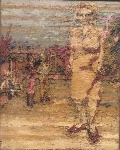
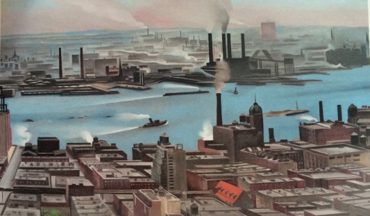
I love ‘America after the fall’ at the Royal Academy. This is a small and incredibly versatile group of 48 paintings that share the fact of being painted during the 1930s depression. They range from scenes of harlem, a dance marathon, sailors picking up prostitutes, industrial landscapes,. new England interiors, a hanging by the Klu Klux Klan and an usherette waiting for a film to end.There were 6 paintings by Grant Wood and for me this work stood out most. I admire the cleanest of the lines, the light and colour, the narrative quality and the dark humour, not least evidenced in the title of the left hand painting below, ‘American Gothic’.These qualities are present in quite number of the different artists works.


There are two Edward Hopper paintings, both beautifully done,but I prefer the New York Cinema painting. This, like a lot of the paintings in the exhibition has a strong narrative drive.Superbly rich colour and light, and sumptious texture.

I think the painting by Peter Blume below is amazing. Peter Blume spent time in Italy in the early 1930s. In this painting below he paints the fall of Rome as an allegory of the fall of America – the Roman Forum is a war zone, with blackshirts fighting the people, conniving capitalists in the trench, fleeing monks, a green-faced Mussolini as a jack-in-the-box, and in a ruined Church, Christ is offered weapons and cash. This seems a terrific comment on America today, or on all shiny, consumer culture and cities at its centre. Butwhat I think amazing is his use of light and colour – the luminosity of this work in reality is astounding.

A number of paintings comment on racism, but in the painting below, W. Johnson shows a young couple out for a night on the town in Harlem.The painting bellows by no means a favourite from the exhibition – in fact I will replace with another.

Apparently the painting below caused an outrage, particularly from the navy, who now own it. I think its great. Paul Cadmus’work, like many of the works in this exhibition,has an extraordinary clarity. Apparently he used egg tempura quite a lot but I’m not sure if he used it below.The expressions on the faces are very funny – ok, its cartoonish,but that doesn’t diminish the fact that it is beautifully painted and makes a good comment on human commodification.

May 2017
Tate Modern. Giacometti retrospective.
I was particularly interested in visiting the Giacometti exhibition because I think his ‘paintings’ are very ‘drawerly’ or his ‘drawings’ are very ‘painterly’. Whichever, there is an interesting relationship between drawing and painting in his two dimensional work and he uses a lot of lines to scaffold his work. Alberto Giacometti was the son of Giovanni Giacometti, himself a famous Swiss Impressionist painter.


It’s interesting to see how Giacometti uses such a limited palette in his paintings – a combination of ochre, grey/green, terracotta, black and white. I can understand why Giacometti is hailed as one of the greatest artists of his generation. There is no doubt that he has an extremely strong and individual style. A ‘Giacometti’, whether a painting or sculpture is immediately recognised as such.


Both painting and sculptures depict the human figure almost exclusively, and both focus on line and elongation of form – in the case of the scultures – until the form is almost only line. To me the most remarkable aspect of Giacometti’s work is his working and reworking the same subject obsessively and countlessly. The exhibition is big and Giacometti produced hundreds of sculpures – for example the first room contains only sculpted heads – some one an inch or two high – and there must be 50 of them. I feel that anyone who works so obsessively at something must be respected for his dedication and determination. It’s interesting to make comparison’s for example, between Moore’s drawing and sculptures and Giacometti. Moore couldn’t be more opposite – his forms are massive, voluptuous – they are smooth where giacometti’s are pitted and sharp and often tiny. Moore’s forms are often about relationships – a mother, father and child. Giacometti’s are invariably singular, isolated – they seem to shrink into themselves. They are like figures who have been extinguished in a great fire. Blackened and burned to the bone. It’s interesting, too, to compare his paintings to those of his father. Although the mother in the painting below (one wonders if this is the baby Alberto) looks sad – the colours are rich and vivid and the painting is bursting with life.

